
ASTROSOPHY
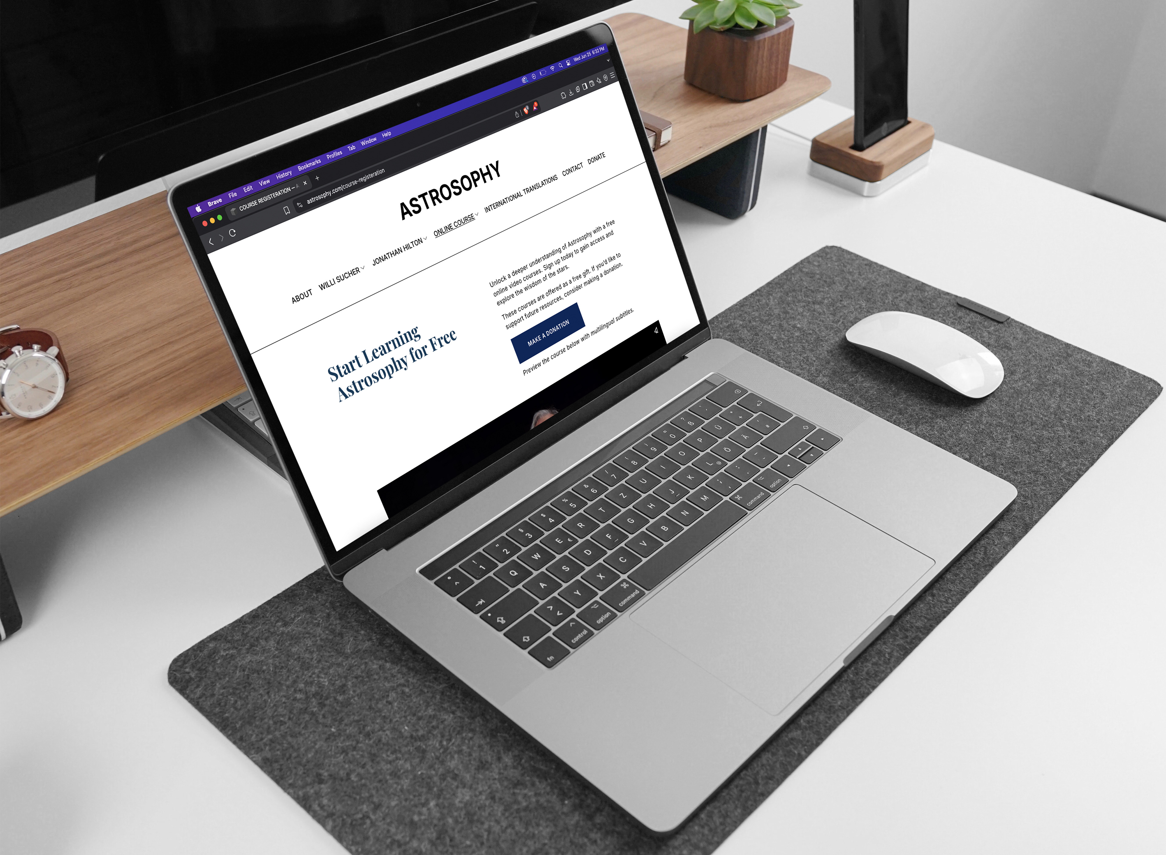
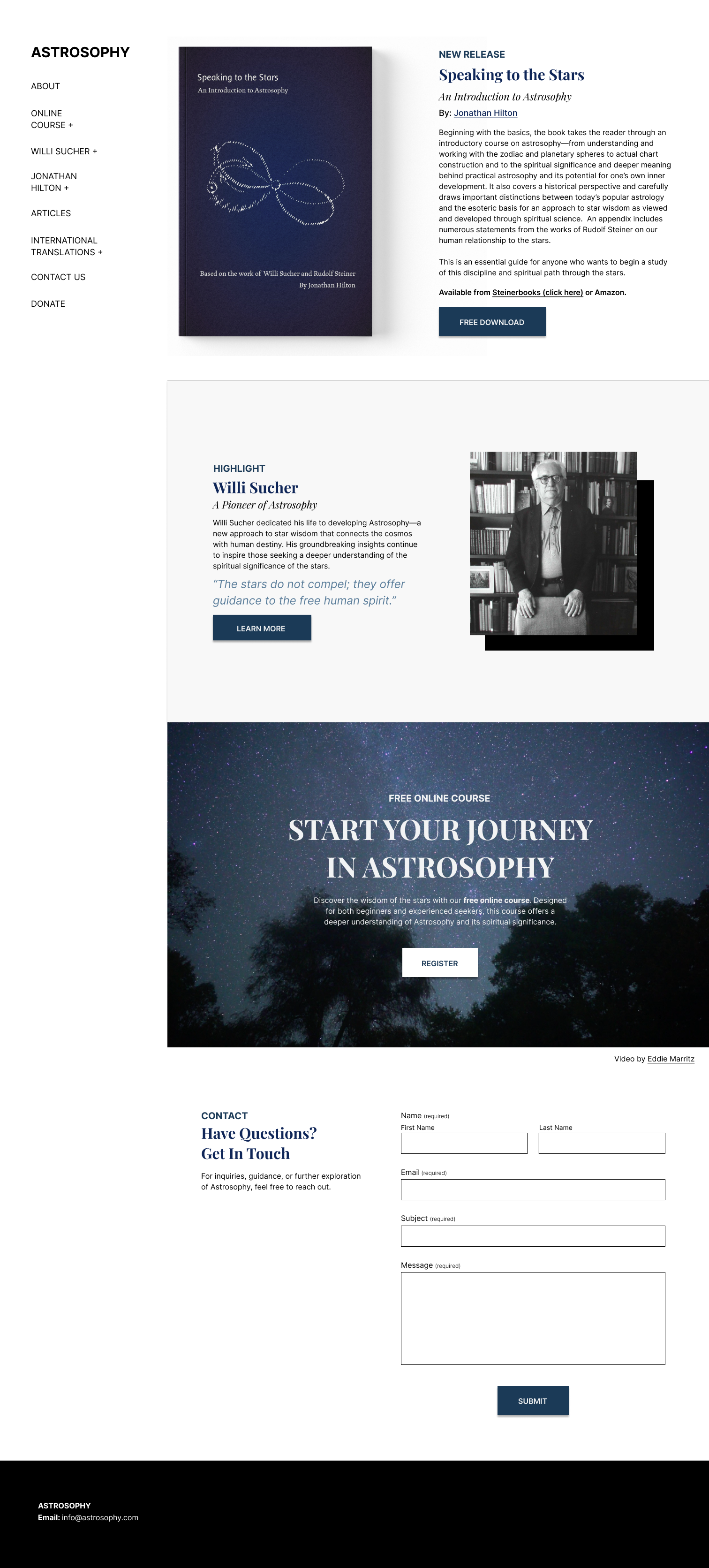
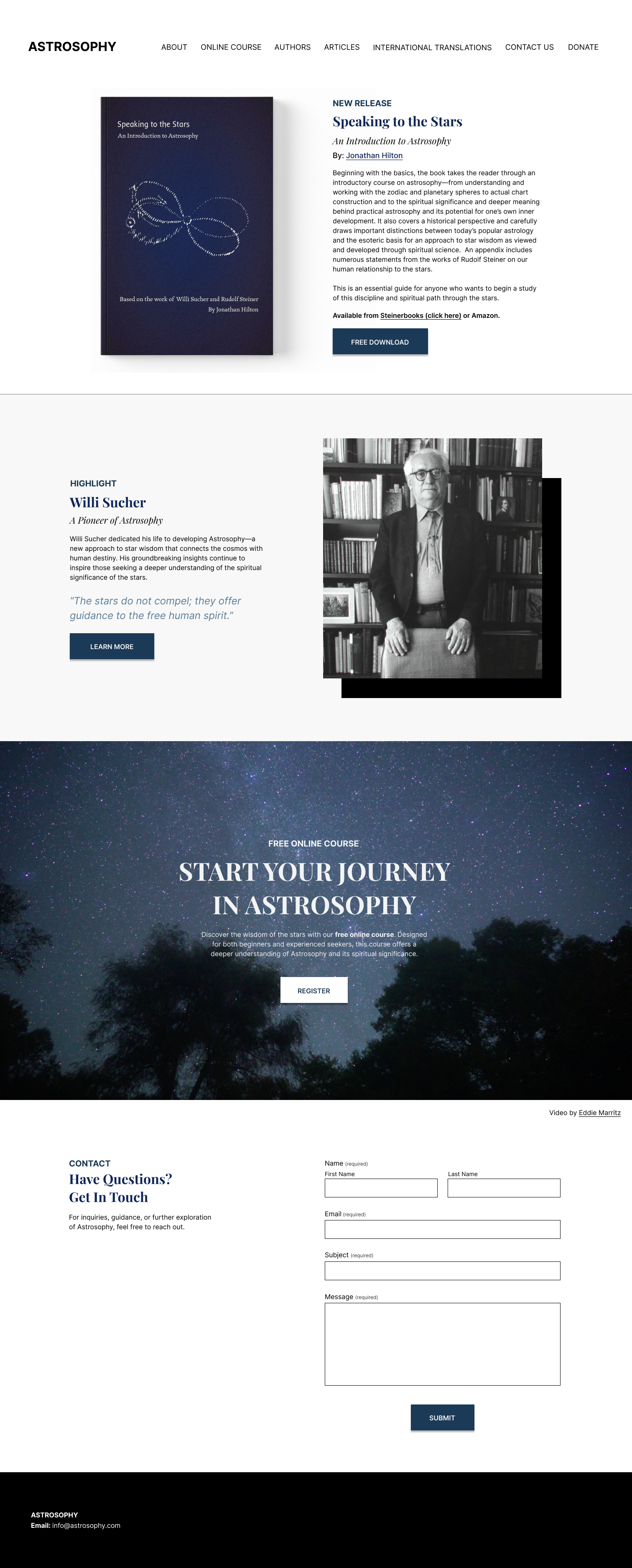
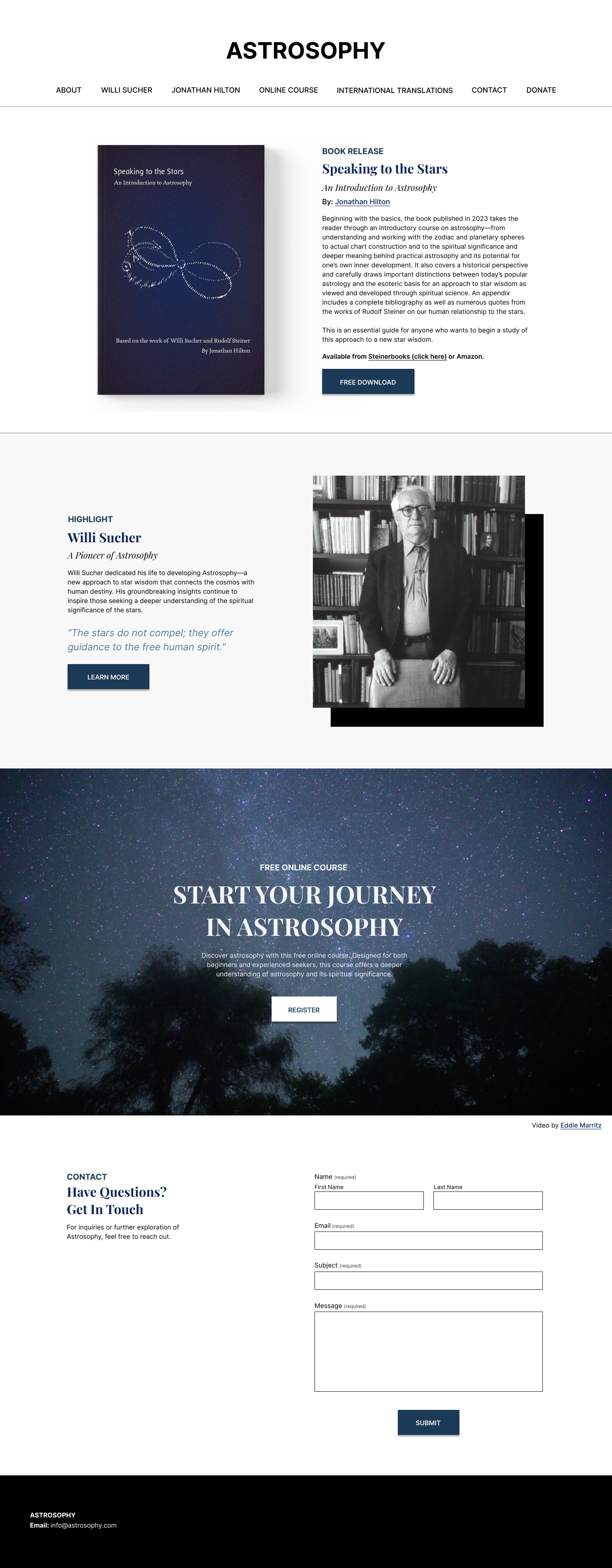
Astrosophy.com is a teaching platform dedicated to a spiritual approach to star wisdom. The client needed a cleaner, more accessible layout, improved navigation for articles and videos, and better organization for international translations. My goal was to enhance usability while maintaining the site’s minimalistic, non-techie aesthetic.
To view the new website: click here
DELIVERABLE
Website Redesign
TOOLS
Figma
Squarespace
The Problem
While the site had a functional structure, it lacked visual clarity and user guidance. There were no clear call-to-actions, no way to easily return to previously viewed content, and the overall design felt disjointed. The course video pages in particular were difficult to track or organize, making it hard for users to follow the material.
The client’s goal: improve content accessibility and visual cohesion for a multilingual audience, while keeping the tone simple, classic, and human — not overly modern or tech-heavy.
My Role
Ux & layout improvements across desktop and mobile
Designed a book feature page with clear hierarchy
Reorganized multilingual content
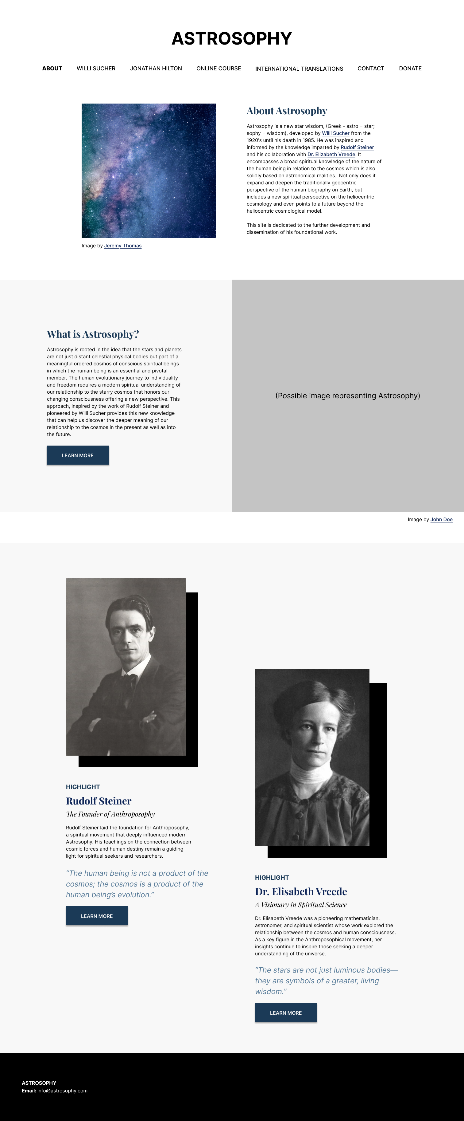
Landing Page
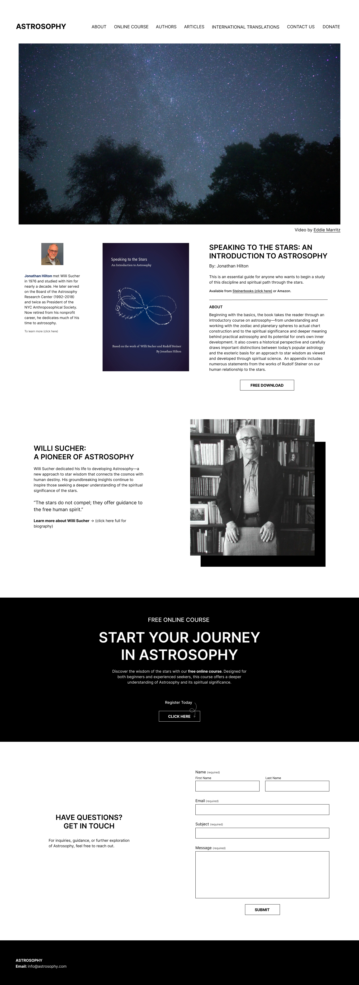
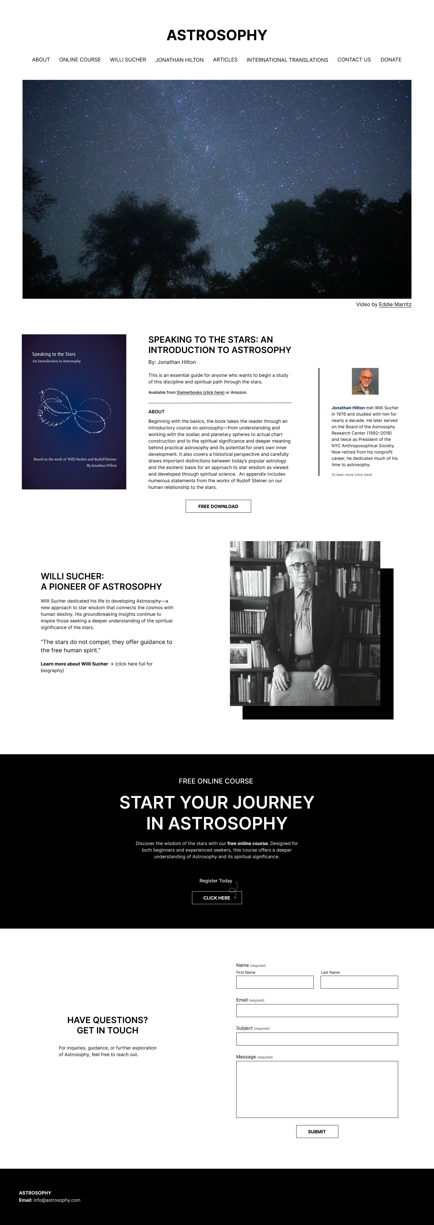
Iterations (7)
Iteration #1
Iteration #2
Iteration #3
Iteration #4
Iteration #5
Iteration #6
Iteration #7
About Page
Iteration & Final
Iteration
Final
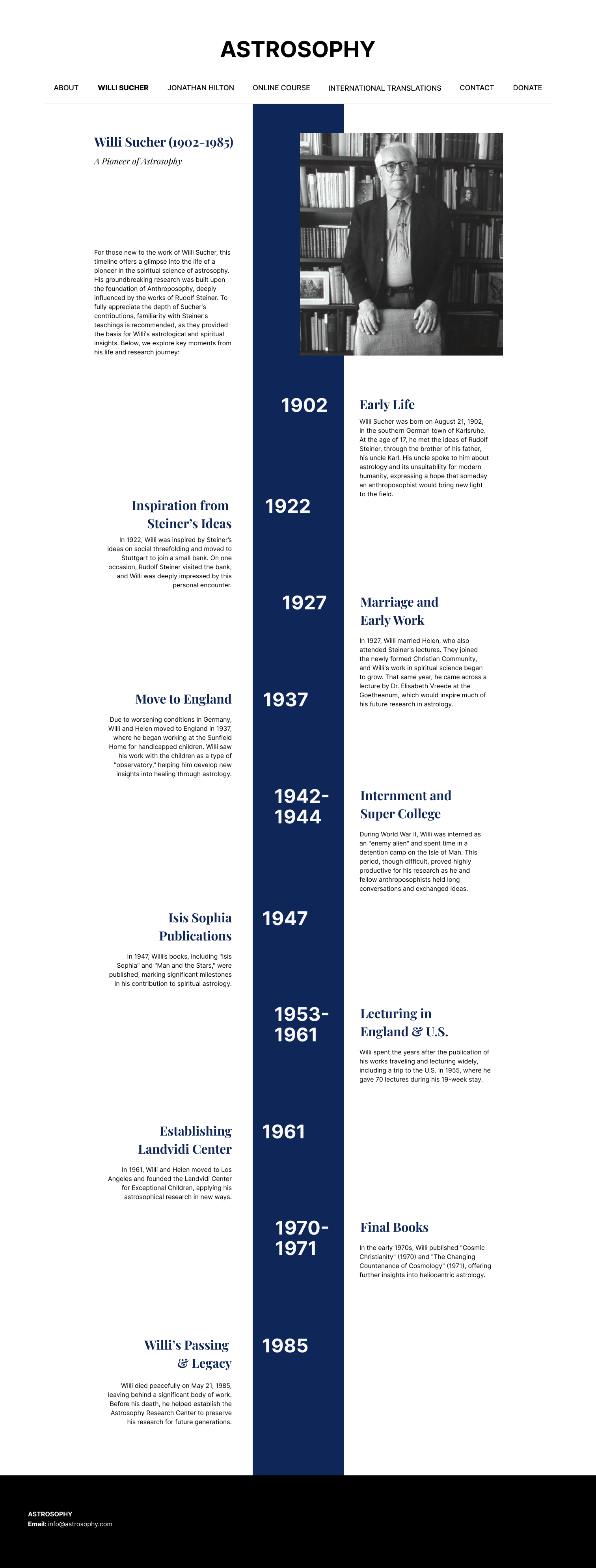
Biography Layout
Iterations (3) & Final
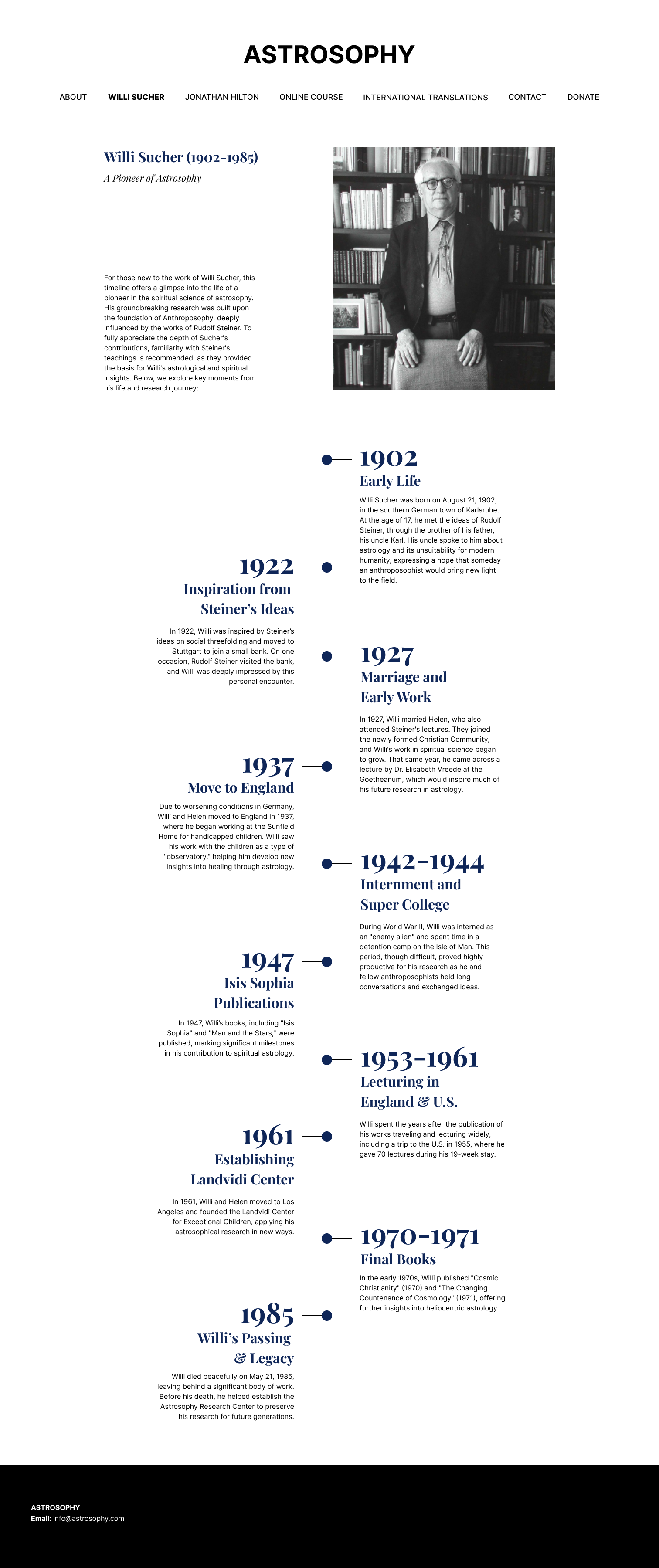
Iteration #1
Iteration #2
Iteration #3
Final
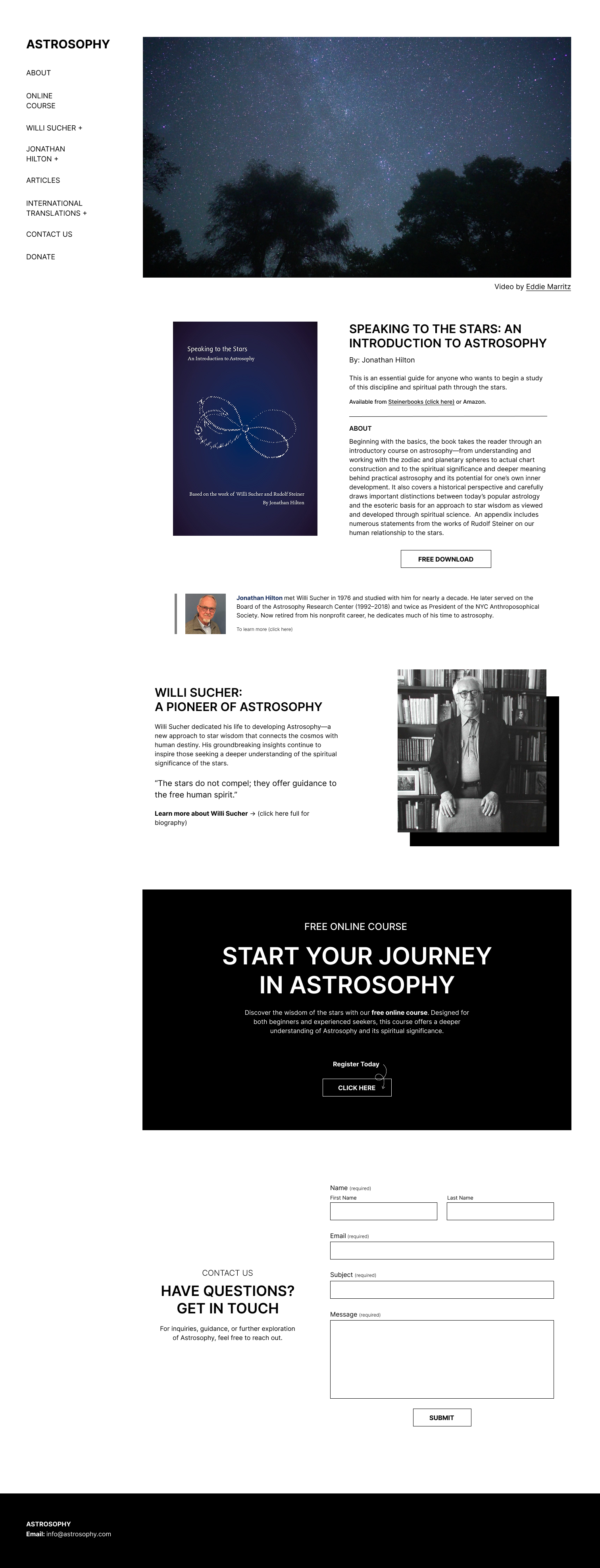
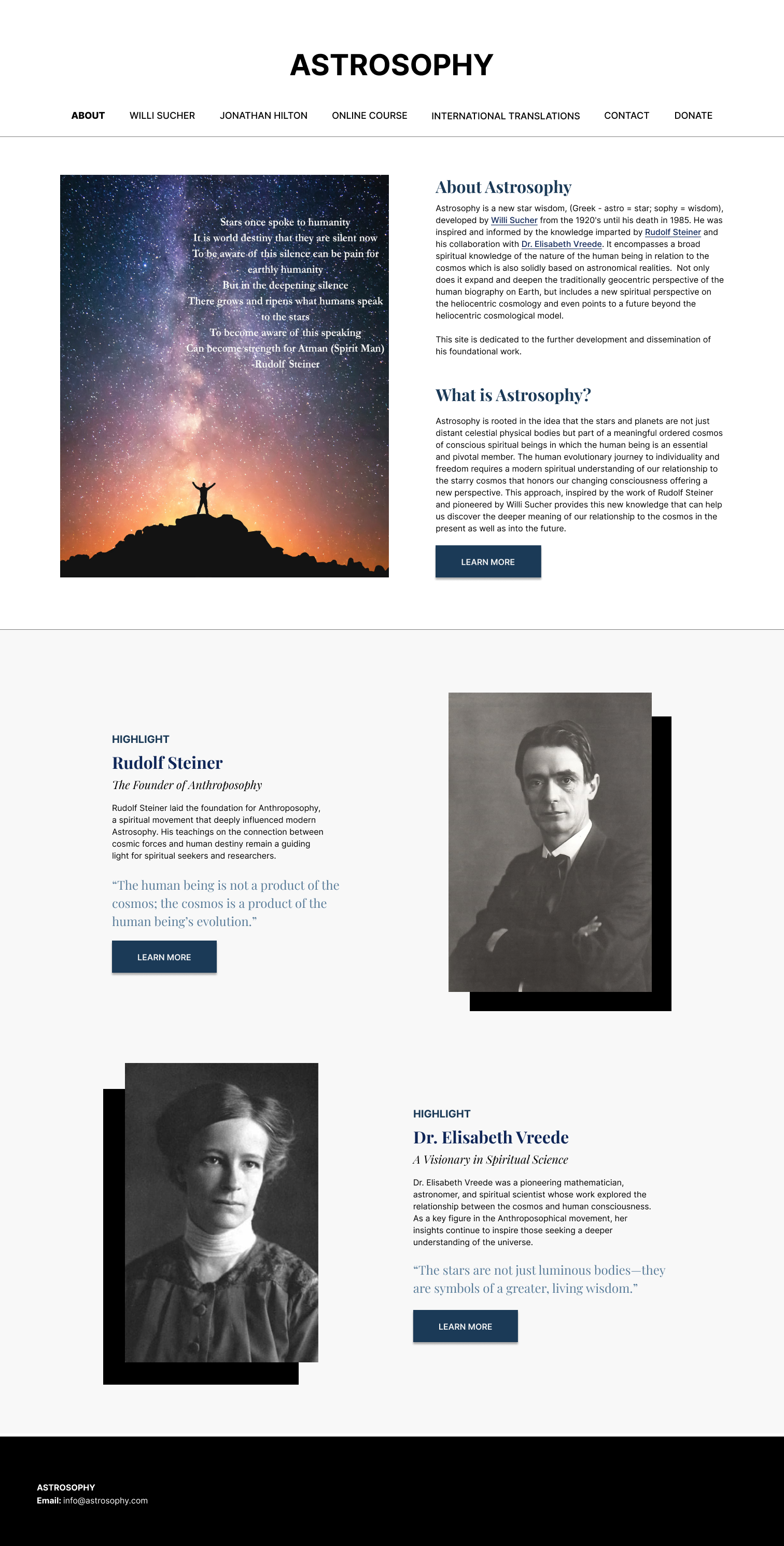
Original Website Design
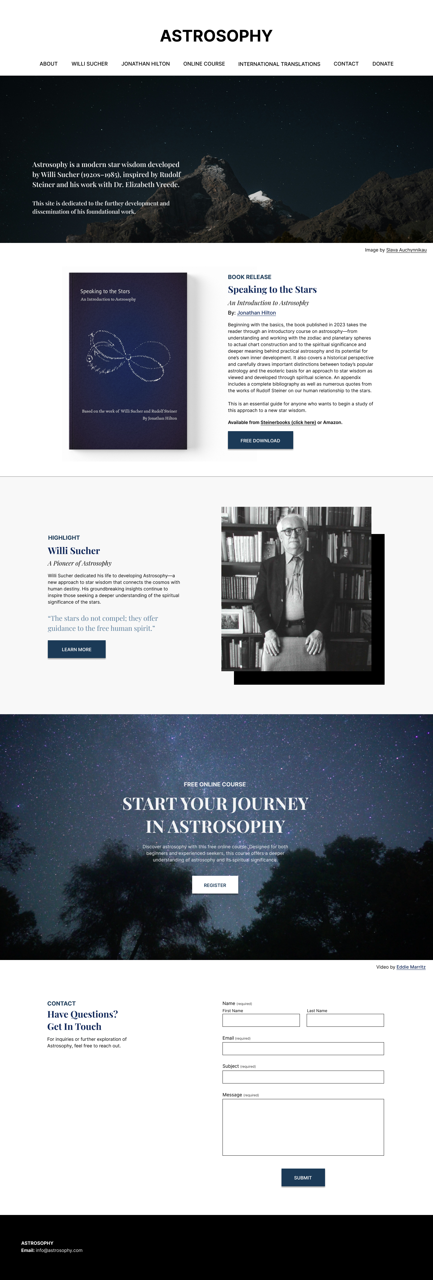
Final Website Redesign
Reflection
This project taught me how to balance client preferences with accessibility standards. I focused on content clarity and cultural adaptability without overwhelming the user with modern UI trends. The result is a cleaner, friendlier site that better reflects the client’s message and serves a global audience.